Cybersecurity in supply chainoperations requires a multi-layered approach that addresses risks across every vendor, platform, and digital connection in your network. The most effective strategies include rigorous third-party risk assessments, zero-trust architecture, continuous monitoring, and clear security requirements built into every supplier relationship from the start.
 Web design is a rapidly changing environment. There is such fierce competition for space and attention that it needs to adapt in order to give people the chance to survive.
Did you know there are, on average, 380 websites created every minute!? Not only is that a lot of new content, but a lot more eyes viewing new things.
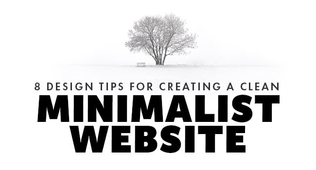
That's how trends start and for something like design that's a good thing. Right now, what you want is a minimalist website. How do you do this? Keep reading, because we have some helpful tips coming up.
When designing a website you want it to focus on usability.
What's the goal? Sales, demos? Is it the start of your sales funnel or are you looking to close deals? Decide on this answer and ensure that primary goal is clear and the design works towards maximizing the efficiency with which users can interact with your site.
One of the top design tips for minimalism is to ensure that content is the focus. Having a flashy looking site means nothing if it sacrifices your content, or dilutes your core message in any way. Minimalism tips the balance in your favor and helps you reap the rewards.
Related Post: Brutalism in Web Design - Where Did It Come From?
Gone are the days of filling every space on the page. Empty or negative space is not to be feared. In fact, it can be a powerful tool in minimalist web design that can help focus user activity and drive people towards the pages you want them to visit.
By adopting minimalism in web design, you're ensuring that everything you put on your site has a purpose.
It has a function. Eliminate the fluff not just from your content but from your design. This helps keep people focus and makes interacting with your business an efficient and happy process.
Use well thought out colors that work well with your brand and other designs, but avoid overpowering things with too many colors. A small palette with good use of an accent color to help pull focus to the right areas. Most minimalist tips will advise sticking to around a three-color limit.
Understanding the power of typeface is an art in itself. Don't be afraid to change things us and use different typefaces to help draw attention to different areas, or to accentuate specific sections of your site.
Adopting minimalism in web design means you need to apply it to everything on the site. That means images too. Clean and crisp images are what you want to use, not overpowering, busy pictures that draw attention away from what really matters, which is your content and the message of the page.
A website is part of your business plan. It has a flow to help bring people from casual passerby to customer. That flow needs to be simple, and it needs to be intuitive. One of the best minimalist tips is to focus on building intuitive navigation to offer an enhanced customer experience.
It doesn't matter if you are a new business or an established name, redesigning your

website to adopt a more minimalistic feel is always a smart move.
Not only is a minimalist website a great way for your users and customers to have a more enjoyable and effective experience, but also, it never truly goes out of style.
Make the move to a minimalist life today. If you don't know where to start, we've got you covered. Just get in touch and we can help make that magic happen.

Don’t trust your company’s critical data and operations to just anyone! This business advisory guide will arm you with 21 Revealing Questions you should ask any computer consultant before giving them access to your network.
7500 Jefferson St. NE
Albuquerque, NM 87109
505-823-3400