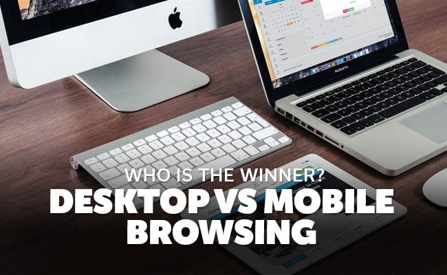
 At one time, nothing was more powerful than a desktop browser. Mobile browsers were second-rate offshoots of their big-brother desktop counter parts. In fact, people used to debate which desktop browser was better: Chrome, Firefox, or Safari.
These days, you don't really hear the same level of debate about which desktop browser is better, you hear more folks talking about their mobile browsers.
An increasing number of people are switching to mobile browsers for a few reasons. Here is a factual breakdown of the pros of desktop vs. mobile browsing:
Personal preference seems to be what will dictate if a desktop or mobile browser will be used. One of the greatest differences determining factors for most users is screen size. Convenience also plays a big part in which browser is also chosen by a user. People want to be able to put the internet in their pocket and travel with it.
They want to be able to access it nearly everywhere they can go. This can not be done with a desktop, or even a laptop computer.
The Winner Is: Whichever browser is most comfortable or convenient for you to use!
When a website is not optimized for mobile viewing and a user is trying to access the site with a tablet or smart phone, they will often get frustrated and leave. This is why every site these days needs to either be a responsive website, able to scale to a mobile size, or have a separate mobile version.
Mobile browsing is quickly becoming the dominant form of browsing for users of all ages. People are finding that the mobile browsing experience is much more convenient and comfortable. A mobile website is often quicker browsing experience which means that there is less loading times.