Cybersecurity in supply chainoperations requires a multi-layered approach that addresses risks across every vendor, platform, and digital connection in your network. The most effective strategies include rigorous third-party risk assessments, zero-trust architecture, continuous monitoring, and clear security requirements built into every supplier relationship from the start.

When it comes to website design, it's hard to overstate how important it is for a business.
In fact, more than 90 percent of people have clicked out of a site just because the design wasn't appealing.
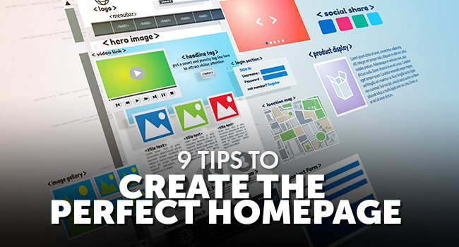
If you're creating a website, follow these nine tips for the perfect homepage design.
When you're creating a homepage, it's important to keep the design polished. The design of your homepage can set the tone for how customers perceive you, and you don't want to come off as unprofessional.
Stick to a cohesive design that fits the tone of your business.
Creating a homepage is important, but you don't want to overdo it. While your instinct might be to fit every piece of relevant information on your homepage, it's better to keep it simple in terms of design and content.
Use short, snappy text and headlines, and don't add every design element that comes to mind.
A picture's worth a thousand words, and you can use high-quality images to grab attention on your homepage. But the advice not to overdo it applies here, too!
While several striking images are great on a homepage, don't put every single great photo you have in one place.
You have a brand identity as a business, and your homepage is the place to share that with your audience.
Make it clear who you are and what you do! Carry that tone and writing style throughout your website.
You'll need to ensure that your homepage not only loads on desktops but also on phones.
A mobile-friendly website is essential, and you'll want to test your site on all devices. This helps bring more users to your site.
Watch our video: Importance of a Mobile-Friendly Website
The homepage is just the first stop for visitors, so you'll want to create a user-friendly page that's intuitive and easy to navigate. That way visitors don't immediately leave the site.
And, when your website is user-friendly, people are much more likely to make a return visit.
Once you've finished creating the perfect homepage, don't forget to make updates. You'll want to make sure the information on your homepage is accurate. This could mean updating deals and promotions or even adjusting hours of operation.
There are plenty of things that go into making a good website, and adding calls to action is one of them.
You'll want to make it clear what you want visitors to do once they reach your website. Make sure this CTA appears before they have to scroll.
When it comes to design, don't be afraid to use color. Contrasting colors can help highlight what's important on a page. Just remember to pick a color scheme and use it consistently throughout your homepage and website.
From keeping it simple to using dynamite photos, there are plenty of important elements to homepage design. Be sure to follow these tips to create a user-friendly website that drives business.
For more website help, visit our blog and scroll through a few more of our helpful posts!

Don’t trust your company’s critical data and operations to just anyone! This business advisory guide will arm you with 21 Revealing Questions you should ask any computer consultant before giving them access to your network.
7500 Jefferson St. NE
Albuquerque, NM 87109
505-823-3400